An email signature is a small block of text that is automatically appended to the end of an email message. It typically includes the sender’s name, job title, and contact information, and is a way for the sender to professionally identify themselves and make it easy for the recipient to get in touch.
In recent years, there has been a trend towards using dark mode in various applications and operating systems. Dark mode is a setting that changes the color scheme of an interface from light to dark, which can be easier on the eyes and more pleasant to look at in low light environments.
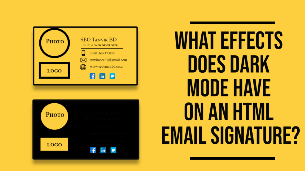
What effects does dark mode have on an HTML email signature?
Dark mode is executed in email clients in one of two ways:
1. Partially Inverted
Inverting light backgrounds to dark backgrounds while leaving existing dark backgrounds alone. The text is treated similarly. Dark text becomes light, but light text remains the same. Outlook.com is an example of this.
2. Fully Inverted
Regardless of whether the text is either light or dark, this mode reverses almost everything in the email. In addition to dark elements being inverted to their light counterparts, light parts are reversed to become dark. This invasive mode makes applying your email signature for dark mode more complicated. Outlook 2019 is one such example.
Some font colors are incompatible with dark mode.
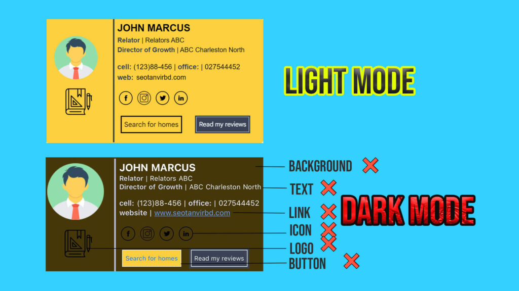
How Can You Make Your Email Signature Light and Dark Mode-Friendly?
1. Image Backgrounds should be Visible:
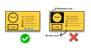
The modifications required for optimizing an image for dark mode will depend on the specific image being used. However, the most frequently implemented change involves utilizing a transparent background. PNG images, which support alpha channels, are ideal for images that need transparency as this allows the image to adapt to any theme or background in email clients or apps. If transparency is not implemented, images with white backgrounds may appear out of place in dark mode due to the contrasting background color.
2. Glow or Outline (if the image has dark parts):
Images with dark hues often face difficulties in dark mode as they blend into the dark background and become difficult to see. While using lighter colors may be an option, it may alter the brand identity of certain logos. To mitigate this, adding white outlines or strokes to the edges of the image can be extremely beneficial. These outlines or strokes are not visible on white backgrounds, making them ideal for logos with dark hues. They come into play in dark mode, making dark-colored images distinguishable from the dark background and allowing the use of dark hues in images, regardless of their size.
3. Select a harmonious color scheme:
Choose a color scheme that complements the dark mode aesthetic, and consider using shades that are easy on the eyes.
4.Ensure text legibility:
When selecting text colors, aim for high contrast to guarantee legibility in both light and dark modes.
5. Adopt clear typography:
Utilize clear, straightforward typography that is easily readable in both environments. Opt for font styles that are simple, yet elegant.
6. Utilize appropriate icons:
Utilize icons that are easily recognizable, and that align with your brand identity, both in light and dark modes.
7. Prioritize concision:
Your email signature should be concise and direct, avoiding any extraneous elements that could detract from its appearance.
8. Validate the design:
Prior to deployment, test your email signature in both light and dark modes to ensure it retains its desired appearance and functionality.

