Mistakes You’re Making With Your Email Signature
In today’s digital age, email has become a primary form of communication for businesses and individuals alike. It’s easy to forget that your email signature can be just as important as the content of your email. A poorly crafted email signature can leave a negative impression on the recipient and may even harm your professional image. In this article, we’ll explore the most common mistakes people make with their email signature and provide tips on how to create an effective one.
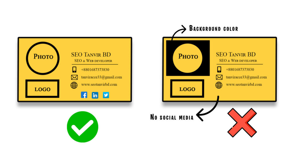
1. Using CSS Background
CSS background is an important aspect of email signature design, as it helps to create a consistent and professional image for your company. However, it is important to consider the limitations and compatibility issues of using CSS background in email signatures, as not all email clients and devices support it.
One of the limitations of using CSS background in email signatures is that some email clients do not support the CSS properties used to create background colors and images. For example, some web-based email clients, like AOL, Yahoo and Hotmail, may not display background colors or images correctly. This can result in the signature appearing differently on different email clients and devices, and can make it difficult for the recipient to read the text and links in the signature.
Another limitation of using CSS background in email signatures is that some email clients may strip out background images and colors for security reasons, leaving the signature with a plain white background. This can affect the overall professional appearance of the signature and make it difficult to read the text and links.

It’s also important to note that using background images can increase the file size of the signature, which can slow down the loading time of the email. This can be particularly problematic when sending emails to recipients with slower internet connections, as they may not be able to view the signature properly.
It’s recommended to use a simple, clean design for your email signature that uses high-contrast colors and clear typography, and test it on different email clients and devices to ensure that it’s legible, professional, and easy to read. This will help to ensure that the signature is consistent and effective across all platforms.
In conclusion, while CSS background can be an effective tool for creating a professional and consistent image for your company, it is important to consider the limitations and compatibility issues of using it in email signatures. By keeping the design simple and testing it on different email clients and devices, you can help to ensure that the signature is legible, professional, and easy to read for all recipients.
2. Using border radius in image or icon
order radius, which is used to create rounded edges on elements in a design, is not universally supported across all email signature platforms. Some email clients and devices may not support border radius, or may display it differently than others.
For example, some email clients may not support the CSS property used to create border radius, while others may not display it correctly. This can result in the signature appearing differently on different email clients and devices, and can make it difficult for the recipient to read the text and links in the signature.
Some email clients and platforms, such as Outlook 2007-2019, do not fully support the use of border radius in email signatures. This means that the rounded edges of elements in the signature may not display correctly or at all.
Also, some web-based email clients, like AOL, Yahoo and Hotmail, have poor support for border radius. Additionally, some mobile email clients may also have limited support for border radius.
It’s important to keep in mind that not all email clients support border radius, and some may display it differently. Therefore, it’s recommended to stick to simple, clean designs that use high-contrast colors and clear typography for your email signature, and test it on different email clients and devices to ensure that it’s legible, professional, and easy to read.
To ensure maximum compatibility and consistency across different email clients and devices, it’s best to avoid using border radius or other advanced design elements that may not be fully supported.
It’s important to keep in mind that while most modern email clients and devices do support border radius, it’s still important to test your signature on different email clients and devices to ensure that it’s legible, professional, and easy to read, even if border radius is not supported.
It’s also important to note that it’s not only border radius, but there are other CSS properties also that may not be supported by all email clients. Therefore, it’s recommended to stick to simple, clean designs that use high-contrast colors and clear typography for your email signature.
3. Not mobile friendly:
As more and more people access their emails on mobile devices, it is important to ensure that the email signature is optimized for small screens and touch-based navigation. This means keeping the design simple, using larger fonts, and including larger clickable buttons and links. It is important to make sure that the signature is easily readable and the links and buttons are easy to tap on mobile devices. This can be achieved by using responsive design, testing the signature on multiple mobile devices and using the appropriate font sizes.
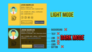
4. Neglecting to consider dark mode:
With the increasing popularity of dark mode on devices and email clients, it is important to ensure that the email signature is legible and easy to read when viewed in this mode. This means using colors that have a high contrast ratio and are easily readable in both light and dark modes. It is important to test the signature in dark mode to ensure that all the text and links are easily readable and accessible

5. Not support in all platform
This means ensuring that the signature looks the same and is functional on different email platforms such as Outlook, Gmail, and Apple Mail, as well as mobile devices. This is important because different email clients may display the signature differently, which can affect the overall professional appearance of the signature and make it difficult for the recipient to access the provided contact information. By testing the signature on different email clients, you can ensure that it is consistent and functional across all platforms, preserving the professional image of your company.
6. Using too many colors
The use of colors and fonts in an email signature is an important aspect of creating a consistent and professional image for your company. However, it is important to avoid using an excessive number of colors or fonts in the design.
Using too many colors can create a cluttered and distracting appearance, detracting from the overall professional image of the email signature. Similarly, using too many different fonts can make the signature difficult to read and can also detract from its professional appearance. It is important to keep the design of the email signature consistent with the branding of your company and avoid any visual distractions.
It is recommended to stick to a maximum of two fonts and two colors in the email signature. This will help to create a cohesive and professional look, making it easy for the recipient to read and understand the provided contact information. Additionally, it is also important to ensure that the colors and fonts used in the signature are legible and easy to read, especially on different devices and screens.
In summary, using a limited number of colors and fonts in the email signature design is an important aspect of creating a consistent and professional image for your company. This will help to ensure that the recipient can easily read and understand the provided contact information.
7. Not including links to social media or the company’s website:
An email signature is a great opportunity to promote your company and connect with potential customers through social media or website links.
Summary:
In today’s digital age, your email signature is a crucial part of your professional image. It’s important to ensure that it includes all the necessary information, uses a simple and modern design, and is optimized for mobile devices. Common mistakes to avoid include not including all the necessary information, using too many fonts and colors, using outdated or inappropriate designs, not optimizing for mobile devices, and including too many quotes or graphics. By following these tips, you can create an effective email signature that leaves a positive impression on the recipient and enhances your professional image.


